curated radio show and i talk about covers/artwork, culture and design and things.
This weeks theme is centred around contrasts. Colours/Energies/ Subversions of things.
So this weeks episode ive compiled a tracklist and prepared some notes around the theme of contrasts. Its something ive always been very enamoured with. Opposites, Polarities, Extremes, Binaries…. Whatever. I find it very interesting because contrast, or two contrasting things create balance, but they do so by being their respective self to an extreme. Which in itself is a bit of a subversive statement, i think. This week ive picked tracks that operate on some plane of contrast, some with subversive themes of lyricism, tracks that utilise contrast in their cover design, using either lots of it or none, aswell as tracks that I feel play into the archetypal binaries, which are also ever present to me when thinking about contrasts. Contrast itself is a really broad term so open yourself to the idea that there can be a sense of balance, even if it hidden, in everything 🙂
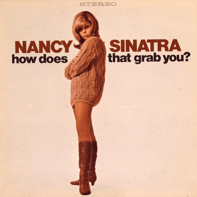
Bang Bang (My baby Shot Me Down)- Nancy Sinatra
I really started to take interest in contrasts when i saw Hilma Af Klints paintings at the Tate Modern. Her painting is spiritual and borderline alchemical and so her use of symbolism and aesthetic messaging to convey something other worldy or outwith our scope of conciousness was key in the detail within her work. Not long after I had a psychdelic experience no doubt shaped by the recent view of her paintings. What i experienced was a sense of the dimensionality or “form” of maculine and feminine energies. The potency of this experience was contributed to the fact I was surrounded by these “masculine” energies. The third show contained a lot of tracks that i feel really embody this “negative” feminine spirit.
The archetypal contrasts of the masucline and feminine became really interesting to me after this, and i think Nancy Sinatra perfectly captures this in Bang Bang. The contrast between that of the singer and the unknown muse helps to convey a dynamic of power the boy of 6, has above herself, at 5. Its a perfect metaphor for (what I’ve experienced) as a typically feminine experience, and specific to that of romantic relationships. Relationships exist in parallel to relationships with ourselves, so this is interchangeable. These are two extremes, and in realtiy we operate over a scale of these things.
Dedicated To The One I Love- The Mamas and Papas
The darkest hour is just before the dawn…. recognisable quip that presents two contrasts as much closer together than previously thought, it presents an image of direct contact of the two contrasts, one precedes so the other can appear. I find it exciting to think about this, but I believe this is where it becomes quite abstract, the irrefutable fact of contrasts is that they are not one another, but it is very exciting to consider the relationship between one and the other, what lies in the distance or closeness.

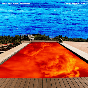
Quixoticelixir- Red Hot Chilli Peppers
I love this song (my boyfriend showed me itXD!) the album cover and this song, they love eachother, they complement each other perfectly; this highlighted through the lyricism, through hyperbole. That is in essence, the use of language to express contrast. I think the use of material/ elements in this colour contrast specifically adds to the extremity, adding a depth of quality to it. Look at it. Listen to it. Dwell on it. Spit on it. Kiss ur lover.
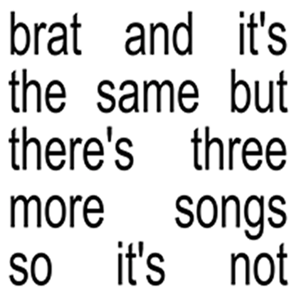
Spring breakers- Charli xcx
This song is off the deluxe version of brat. Brat, the original album, I discussed in my first episode, and it was actually the inspiration for the theme of that episode (cycles/beginning and endings) I wasn’t a huge fan of Brat, to be honest, i was more interested in the culture surrounding it. I was very intrigued but unsettled by it.
Spring breakers got an inclusion as my honorary 💯absolute contrast image💯.
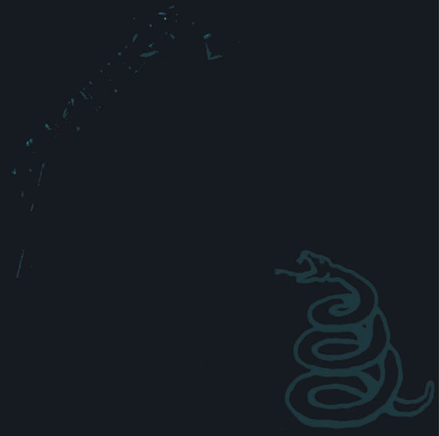
Nothing Else Matters- Metallica
This is possibly my favourite cover of the whole show, because it uses contrast on the lower end of the spectrum. I love to think about zooming right down to the particulate level of the entire colour spectrum and wondering where they cut the line, when is the colour the next colour. Low contrast, to me, is like a fun trick on the eyes. It is so light it appears backlit, glowing, the result of the intercept of memory of environment and our innate visual processing. When doing personal design work I am always torn between actual readability and readable aesthetic. It’s because of this!
Next Show in December 21-23:00hrs
 god’s favourite boy